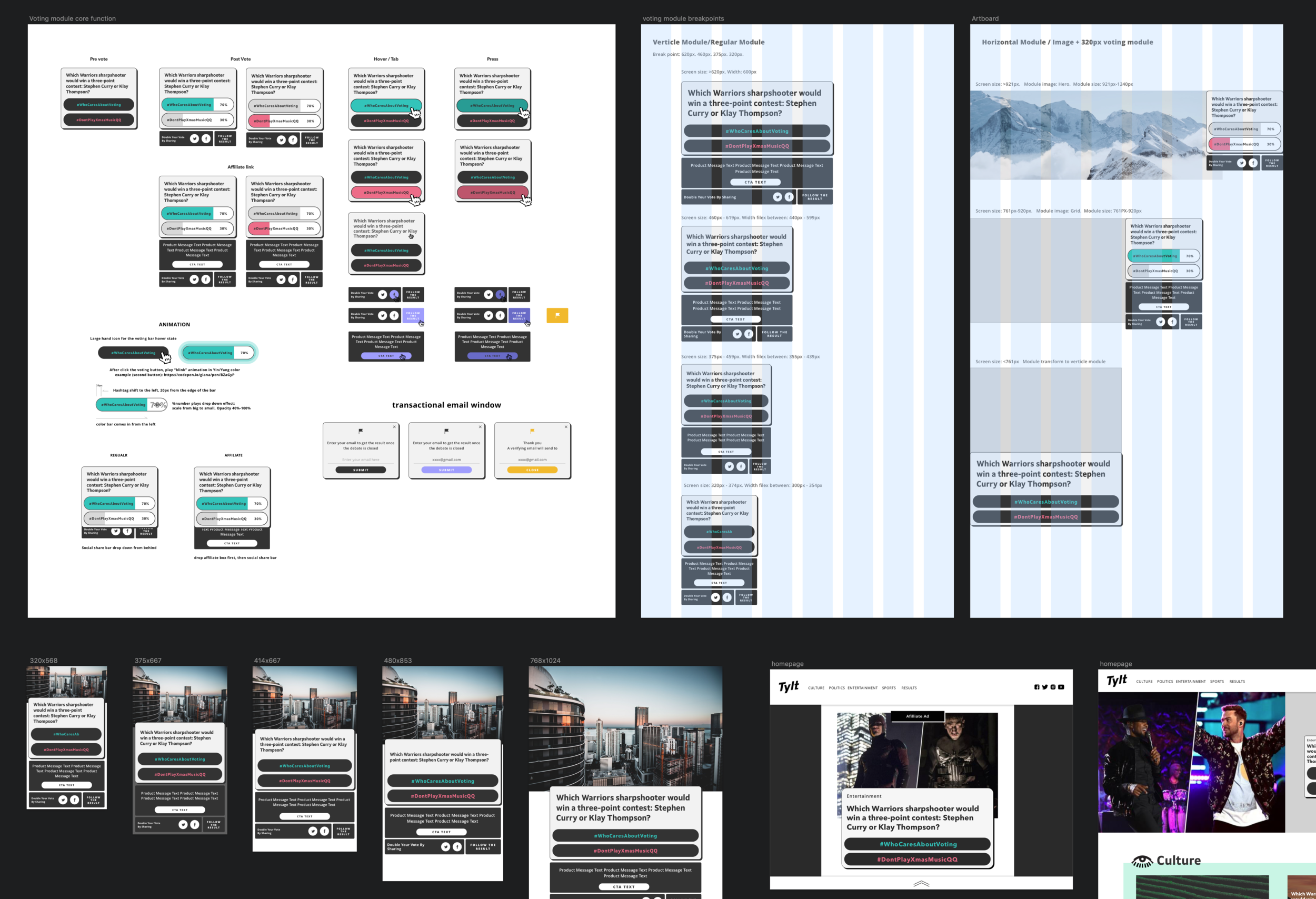
CURRENT DESIGN AND PROBLEM

Problem we learned from user testing:
1. Information is not clear enough
2. Voting button design is confusing, users don’t know where to click. On mobile the button design also confuse the hand movement.
3. Lack of interaction. User experience is not smooth
4. Not fully responsive
NEW DESIGN AND THINKING
Who are the users: According to the data, more than 70% of the users are between 15-35 years old. The most popular topics are pop culture and politics. Big drive for voting is fan based or from social influencers.
User persona: Age 22; Spend average 4 hours on social media per day; has huge interest in K-pop; Texting, voice chatting with friends, prefer use emoji and cartoon like design; Constantly check out what is popular; Scared of left behind
What is our goal: If the user has a free 5 mins. We want them come to our site, grab their attention with clean and fresh design, vote as much as they can and maybe left with a social share of their votes. We want to present The Tylt as a fun place to be in your spare time.

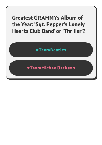

Our New design inspired by retro video games, which presented clear information with 2 option to choose. The voting button design is now straight forward, they look like a button, feel like a button and react like a button. We separate the main question and the CTA section to make the information structure clear. Polished user experience with micro animations to make the voting experience fun and easy.
Also the new design is fully responsive, which is versatile to adapt into design module design.